Bad Data, and Good Data turned Bad

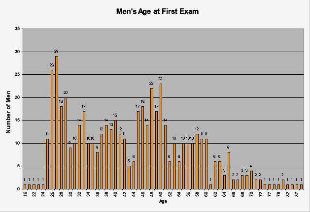
This data shows the age of the men that visited the doctor the
first time in the Tuskegee experiment. This graph is interesting because you
can see the almost 400 subjects that were in this experiment and their ages at
the beginning of this disease. Although the data is good the graph is hard to
read and see how many men were each age.


http://www.examiningtuskegee.com/Images/chart_9.gif
This shows the deaths of the individuals without syphilis the
“control group” in the Tuskegee experiment over the 40 years that the
experiment was conducted. This graph is not helpful because mostly these control
individuals pass away from natural problems not syphilis.
Rachel, I don't see the actual graphs. You need to click on "Save as" on the image, so they download to your computer, then Insert/Upload them into the post. I also want to see a bit more of a discussion about the actual structure of the graph and the reliability of sources, since this is practice for the final project writeup.
ReplyDeleteI didn't realize I hadn't inserted your URL in the tab until now, sorry about that! I will make sure to tell people next lesson to comment on your posts so far.
Please address my feedback so that you get the full score for this blog post.
DeletePlease address this feedback and let me know when you do so I can adjust your grade
Delete